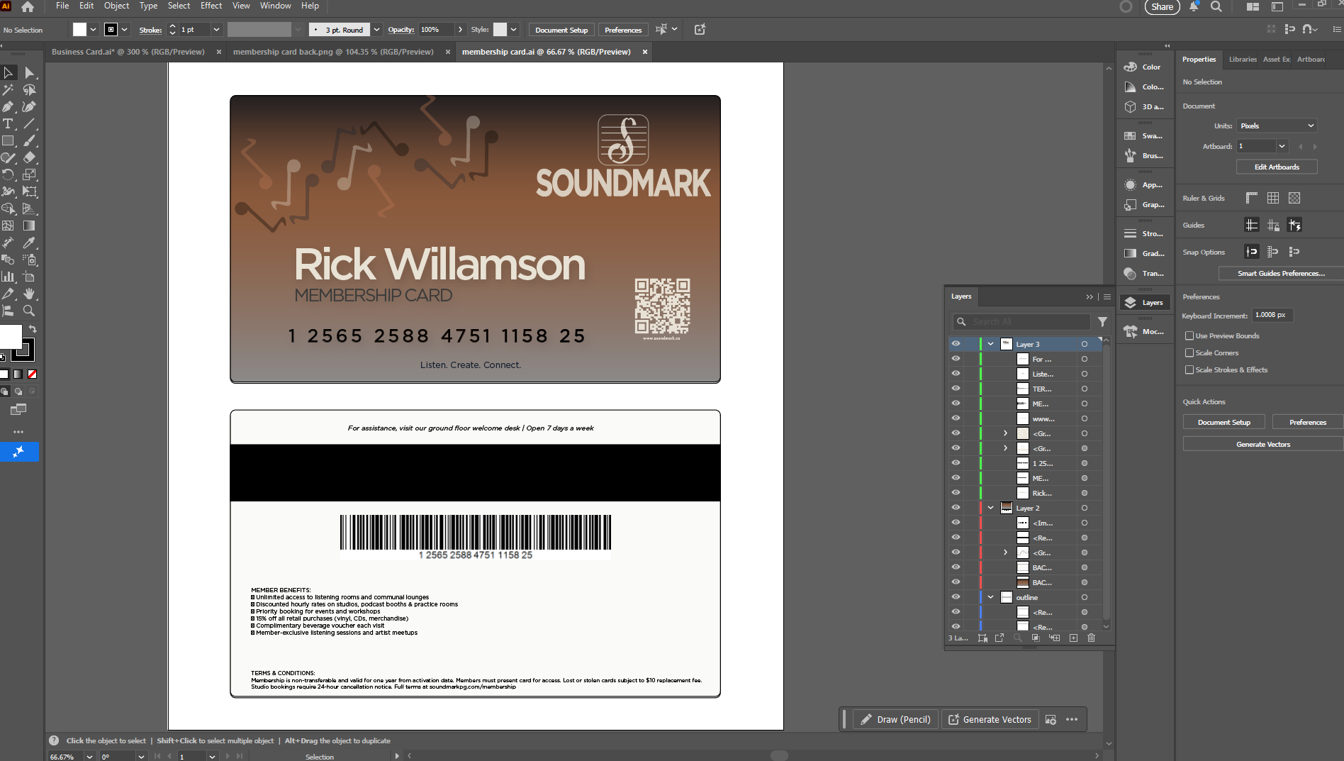
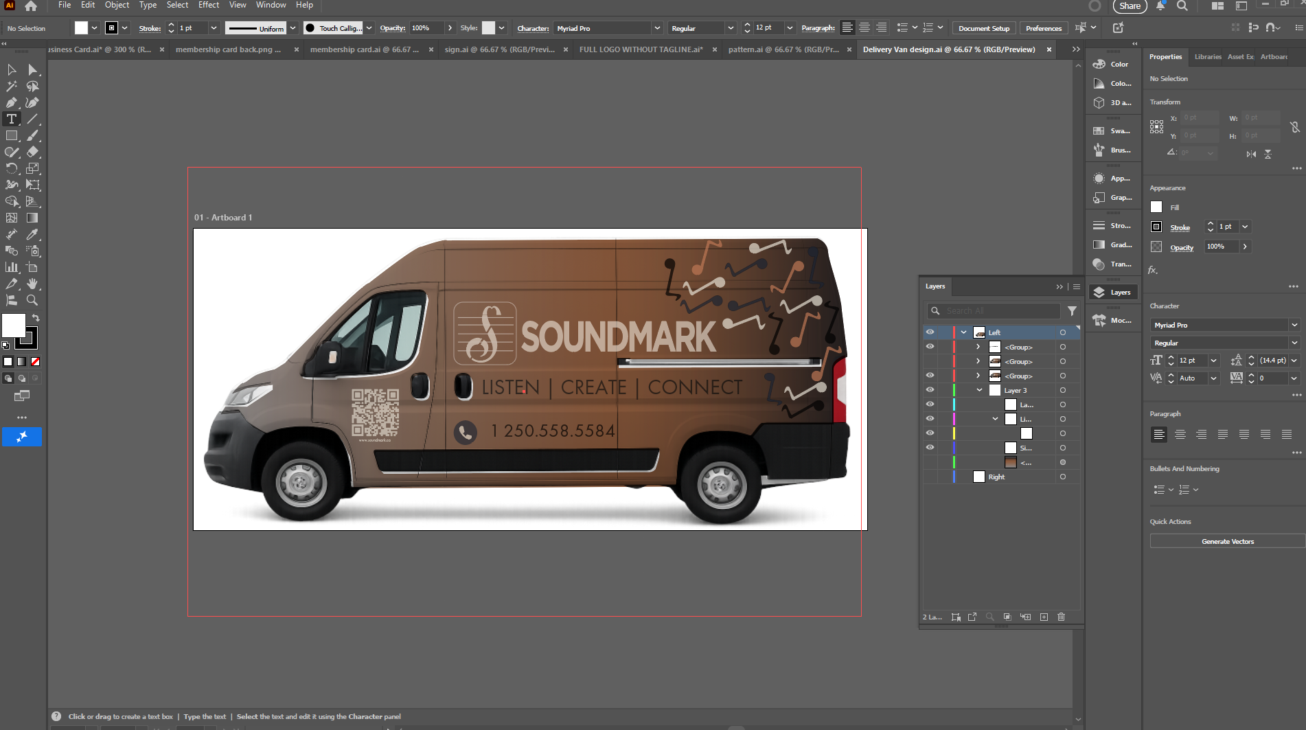
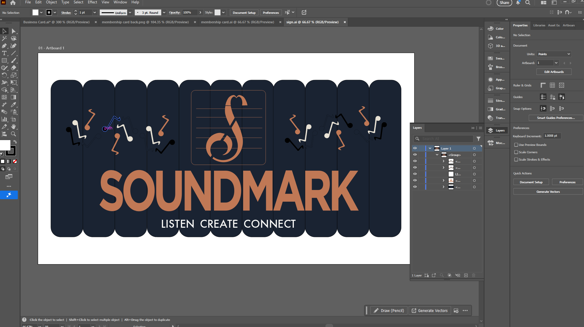
Brand Identity · Conceptual Project · 2026

Soundmark

A complete brand identity for a conceptual multi-story music destination — a space where people listen deeply, create freely, and connect through sound.

Role
Brand Designer
Scope
Logo, Visual System, Brand Applications
Context
WEGD 2026 Program · CNC
Deliverables
Logo, Colors, Pattern, Icons, Cards, Van Wrap, Signage
01 — The Brief

A music destination that goes beyond passive listening

Soundmark is a conceptual four-story music destination — part listening lounge, part creative studio, part community hub. The ground floor houses a café and vinyl retail. The second floor offers private listening rooms with high-end headphones and curated libraries. The third floor provides recording booths and production workstations. The top floor is an event space for album listening parties and intimate performances.

The brand needed to feel sophisticated enough for audiophiles but approachable enough for anyone who's ever wondered "what if music sounded better than my earbuds?" Timeless and premium, never pretentious.

Knowledgeable but never gatekeeping. Passionate without being pretentious. Professional quality meets everyday accessibility.
02 — The Logo

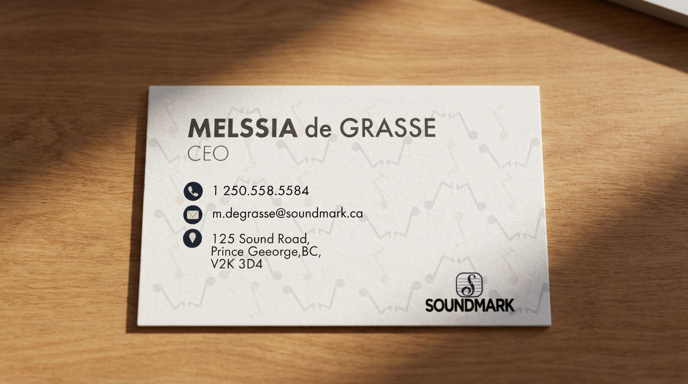
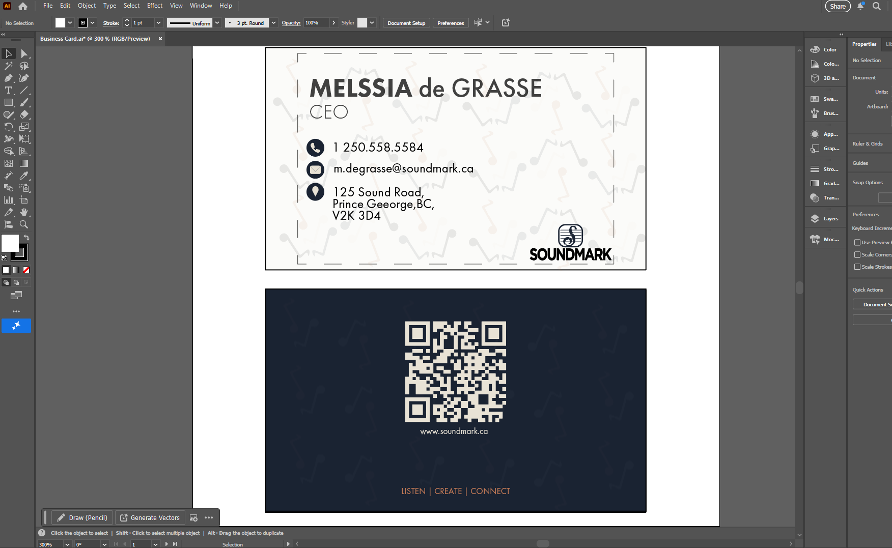
A G-clef that became an S-clef

I explored multiple directions — typographic treatments, standalone marks, icon-plus-wordmark combinations. The final mark is a G-clef reimagined as an S-clef, with the top of the S forming an M shape for "Mark." The five horizontal lines reference a music staff. It's a single symbol that encodes the brand's identity: sound, structure, and musicality.

The wordmark uses Gotham with tightly tracked letters, giving the logotype a confident, grounded presence alongside the expressive mark.

Soundmark logo mark explorations Early mark explorations — testing graphic approaches for the S-clef concept
Soundmark wordmark typography explorations Wordmark exploration — testing weights, spacing, and split treatments in Gotham
Final Soundmark logo with annotation Final mark — G-clef turned S-clef, M in the top, staff lines integrated
03 — Logo Variations

Tested across light, dark, and brand color contexts

The logo was placed into a rounded container and tested across multiple background and color scenarios to ensure it holds up in any application context — from dark signage to light print collateral to the copper brand accent.

Soundmark logo in multiple color variants Logo variants — white, cream, navy, copper, and reversed applications
04 — Color & Pattern

A palette rooted in analog warmth

The foundation document proposed three palette directions. I worked with the Navy Foundation palette — deep navy as the primary, warm cream for contrast, and copper as the accent. The copper tone references vintage audio equipment and analog gear, grounding the brand in tactile, physical sound experiences rather than digital sterility.

I also designed a custom repeating pattern using stylized music notes — a subtle brand texture that appears on business cards, membership cards, and environmental applications. The pattern uses both the copper and cream tones against navy, creating visual rhythm across surfaces.

Soundmark color palette options Color palette options — Classic Contrast, Navy Foundation, and Monochrome + Warmth
Soundmark custom music note pattern Custom music note pattern — designed as a repeating brand texture in Illustrator
Soundmark custom icons Custom icons — phone, email, and location designed to match the brand's visual language
05 — Brand Applications

From cards to vehicles to architecture

With the identity system locked, I applied it across the full range of deliverables outlined in the brand foundation document — business cards, membership cards, a vehicle wrap, and exterior building signage. Each application maintains the same visual language: navy base, copper accents, the music note pattern as texture, and Gotham as the typographic anchor.

Soundmark business card mockup Business card — front with custom pattern, icons, and logo lockup
Soundmark business card in Illustrator Soundmark membership card in Illustrator
Soundmark delivery van wrap design Van wrap — logo, tagline, QR code, and contact applied in Illustrator
Soundmark van wrap animated with Veo 3.1 Van wrap brought to life using Google Veo 3.1 — an 8-second video of the branded van driving on the road
06 — Environmental

Bringing the brand into physical space

The building signage was designed to be bold enough to be seen from street level but not overpowering — the navy background with copper wordmark and S-clef mark creates a warm, inviting presence. The music note pattern frames the logo, carrying the brand texture from print into architecture.

An AI-generated building mockup was produced to visualize how the signage would sit on a real multi-story facade in a downtown context.

Soundmark building signage design Building sign — navy base with copper mark, pattern frame, and tagline
Soundmark building facade mockup
07 — What Was Delivered

A complete identity system from concept to application

01
Custom Logo Mark
G-clef/S-clef hybrid with integrated staff lines, tested across 8 color variants
03
Color Palette Options
Classic Contrast, Navy Foundation, and Monochrome + Warmth — Navy selected as primary
01
Custom Pattern System
Repeating music note pattern in copper and cream for brand texture
03
Custom Icons
Phone, email, and location icons designed in the Soundmark visual style
05
Brand Applications
Business card, membership card, van wrap, building sign, and facade mockup
01
Brand Foundation Doc
10-page document covering mission, values, audience, space concept, and visual system
Back to Home © 2026 Rubato Creative Studio